Introduction
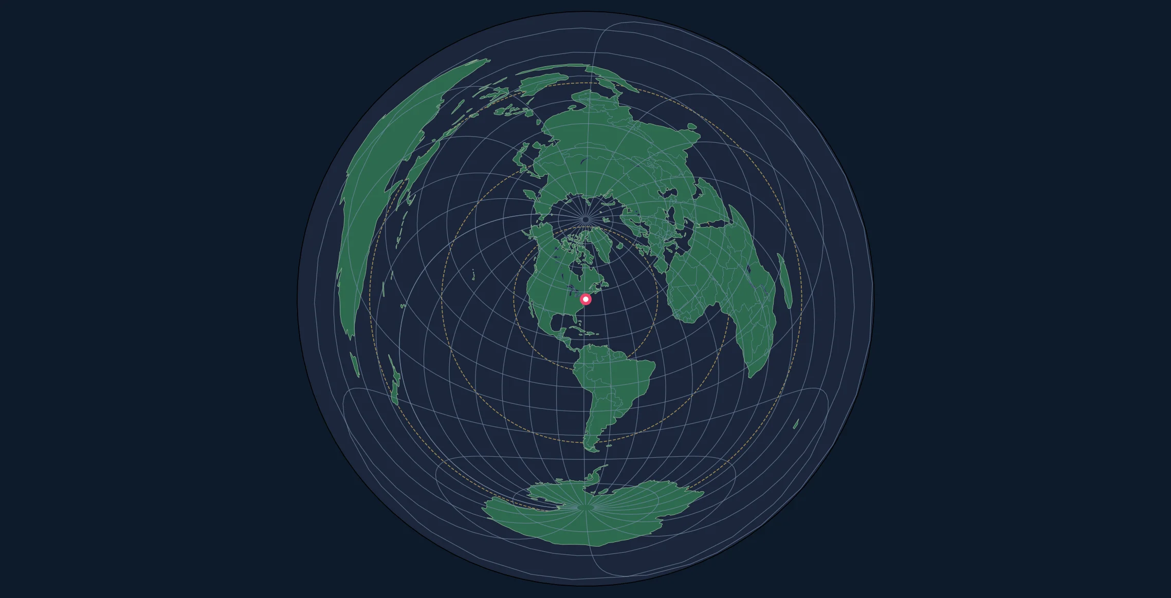
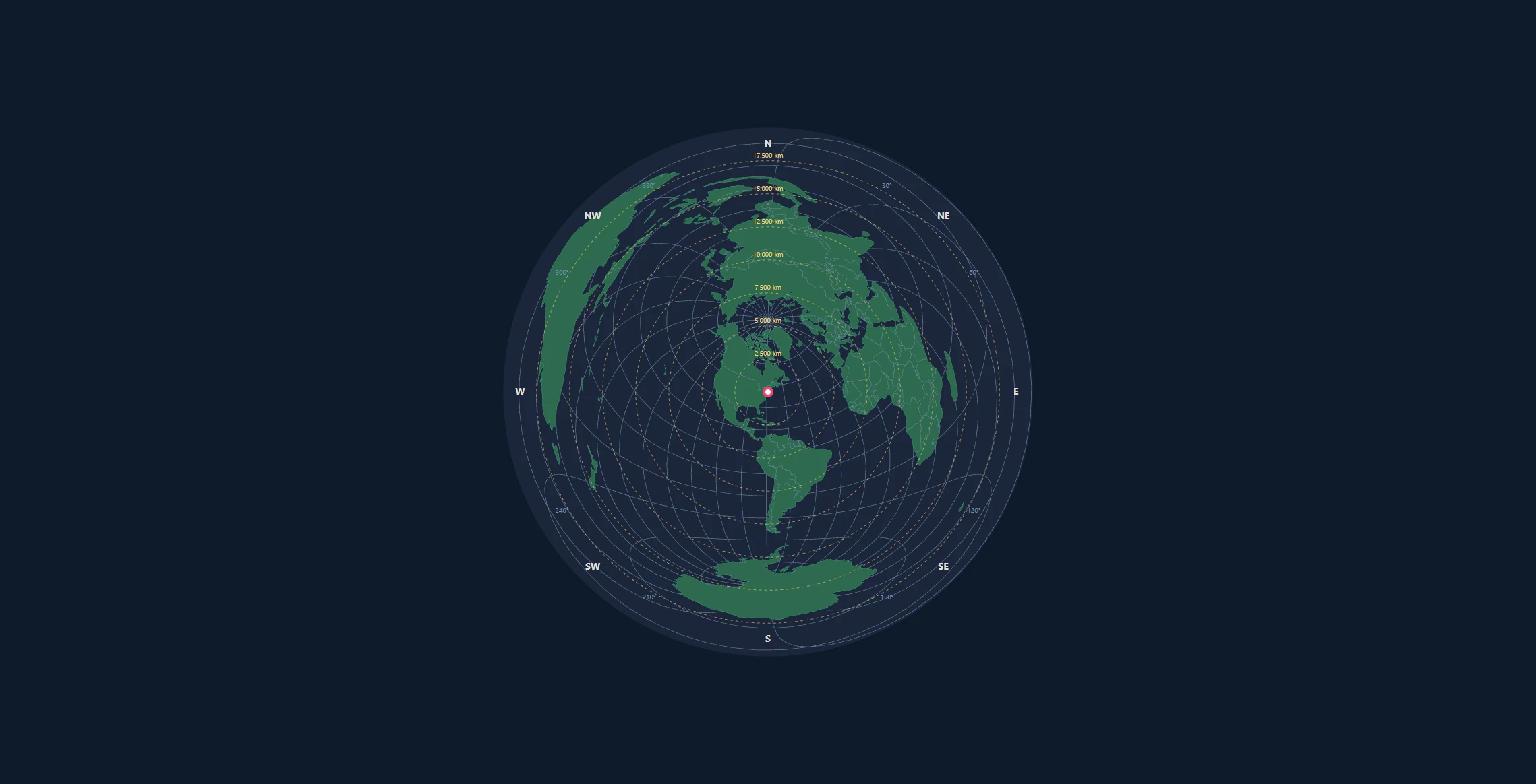
When a map needs to support proportional area comparisons, the Lambert Azimuthal Equal-Area projection is a suitable choice. Unlike an azimuthal equidistant projection, it makes a country or region's area on the map proportional to its surface area on Earth.
This makes equal-area projections essential for:
- Choropleth maps (regions shaded by data values)
- Population density visualizations
- Environmental and land-use mapping
- Statistical maps where area comparisons matter
- Thematic cartography in academic publications
In this tutorial, you'll learn to create publication-quality equal-area maps with Python's Cartopy and Matplotlib libraries.
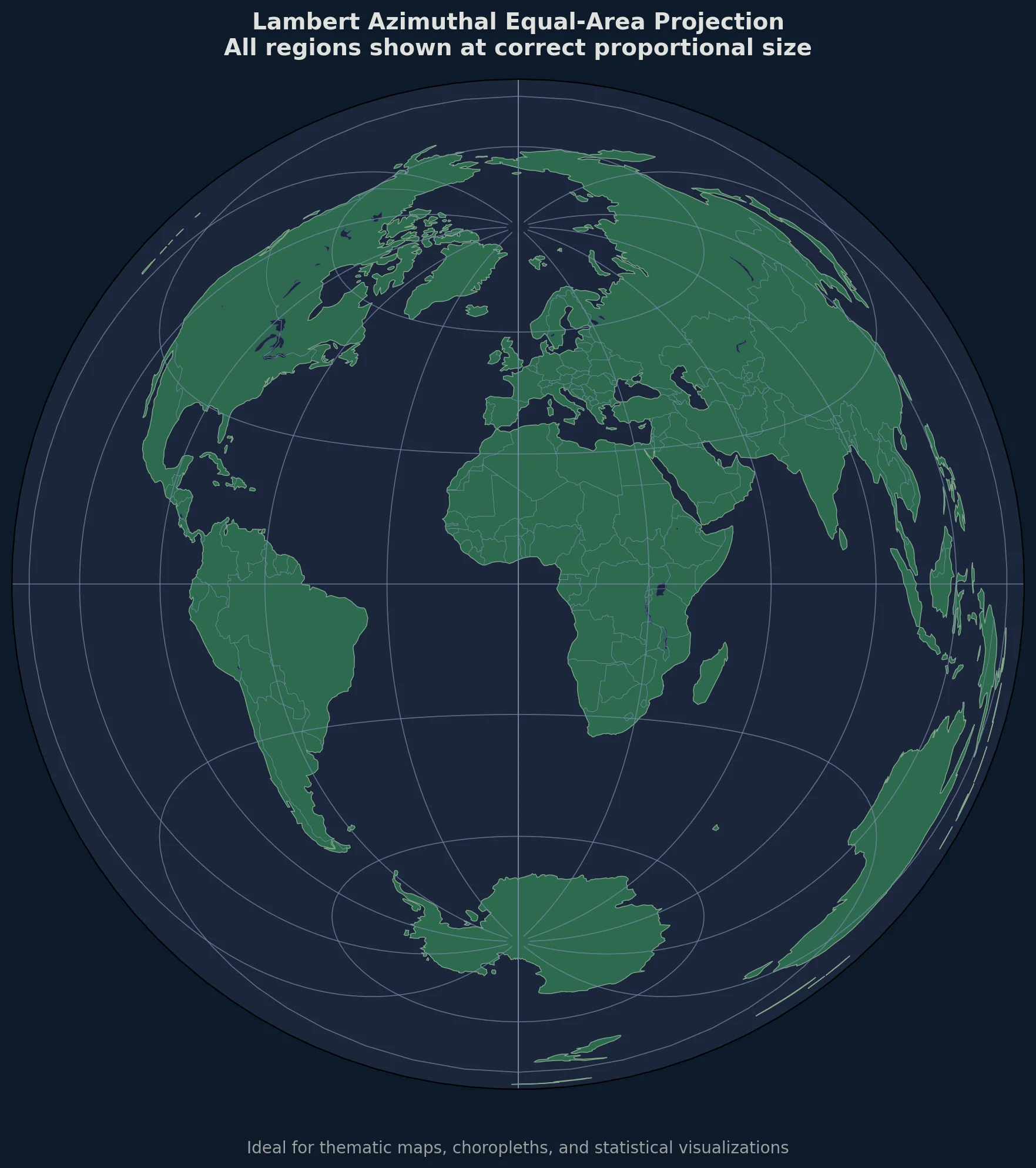
When to Choose Equal-Area Over Equidistant
| Use Case | Equidistant | Equal-Area |
|---|---|---|
| "How far is Tokyo from here?" | Yes | No |
| "Which country is larger?" | No | Yes |
| Radio antenna pointing | Yes | No |
| Population density map | No | Yes |
| Flight distance planning | Yes | No |
| Electoral district comparison | No | Yes |
The key rule: If your map is about distances, use equidistant. If it's about quantities per area, use equal-area.
Setting Up Your Environment
Installation
# Create and activate virtual environment
python -m venv cartopy-env
source cartopy-env/bin/activate  # or cartopy-env\Scripts\activate on Windows

# Install required packages
pip install cartopy matplotlib numpy pandas geopandas
For conda users (recommended for Windows):
conda create -n cartopy-env python=3.10
conda activate cartopy-env
conda install -c conda-forge cartopy matplotlib geopandas
Understanding the Lambert Projection
Mathematical Foundation
The Lambert Azimuthal Equal-Area projection preserves area by compressing radial distances from the center while expanding tangential distances. For a unit sphere, the formulas are:
$$x = k' \cos\phi \sin(\lambda - \lambda_0)$$
$$y = k' [\cos\phi_0 \sin\phi - \sin\phi_0 \cos\phi \cos(\lambda - \lambda_0)]$$
Where the scale factor $k'$ is:
$$k' = \sqrt{\frac{2}{1 + \sin\phi_0 \sin\phi + \cos\phi_0 \cos\phi \cos(\lambda - \lambda_0)}}$$
Here $(\phi, \lambda)$ is the point and $(\phi_0, \lambda_0)$ is the projection center. Multiply the resulting coordinates by sphere radius $R$ for linear units. This differs from the equidistant projection, where radial distance scales linearly with angular distance.
In Cartopy
import cartopy.crs as ccrs

# Create Lambert Azimuthal Equal-Area projection
projection = ccrs.LambertAzimuthalEqualArea(
    central_longitude=10.0,   # Europe-centered
    central_latitude=52.0
)
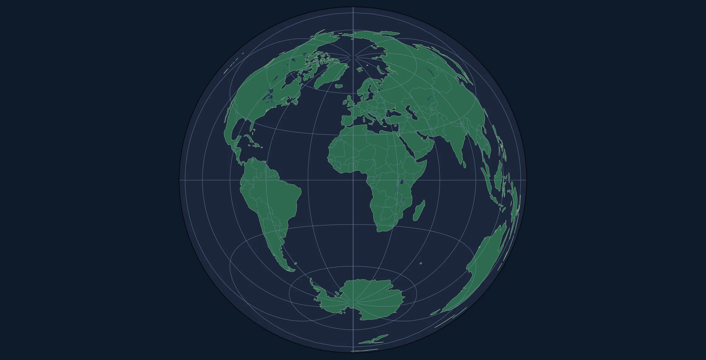
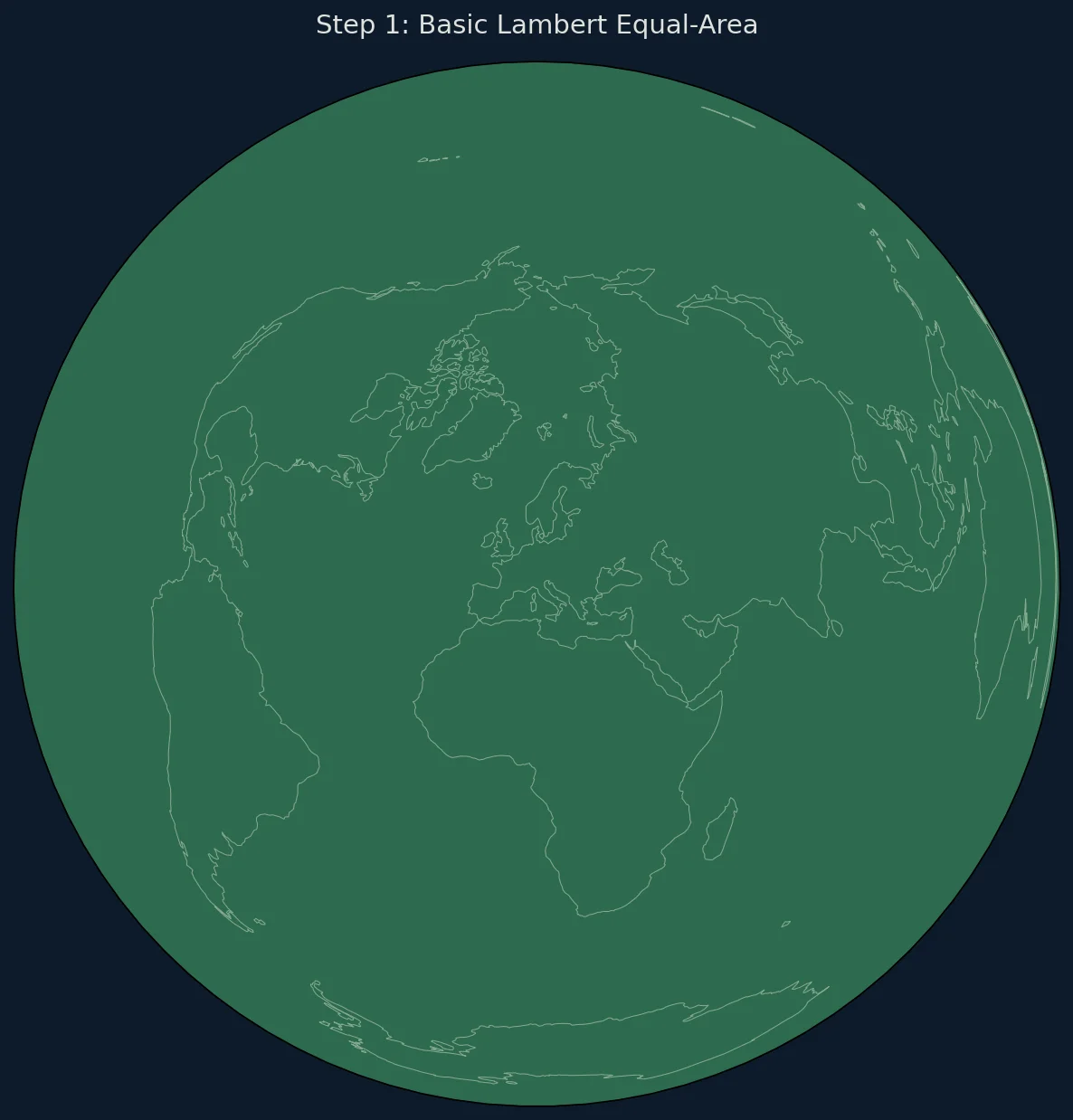
Creating Your First Equal-Area Map
Basic World Map
import matplotlib.pyplot as plt
import cartopy.crs as ccrs
import cartopy.feature as cfeature
import numpy as np

# Configuration
center_lat = 0      # Equator
center_lon = 0      # Prime Meridian

# Create figure
fig = plt.figure(figsize=(12, 12), facecolor='#f0f0f0')

# Create projection
proj = ccrs.LambertAzimuthalEqualArea(
    central_longitude=center_lon,
    central_latitude=center_lat
)

ax = fig.add_subplot(1, 1, 1, projection=proj)

# The spherical LAEA hemisphere boundary is sqrt(2) times Earth radius.
earth_radius = 6371008.8
hemisphere_radius = np.sqrt(2) * earth_radius
ax.set_extent(
    [-hemisphere_radius, hemisphere_radius,
     -hemisphere_radius, hemisphere_radius],
    crs=proj
)

# Add features
ax.add_feature(cfeature.OCEAN, facecolor='#a8dadc')
ax.add_feature(cfeature.LAND, facecolor='#f4a261', edgecolor='#2a9d8f', linewidth=0.5)
ax.add_feature(cfeature.BORDERS, linestyle=':', linewidth=0.5, edgecolor='#264653')
ax.add_feature(cfeature.LAKES, facecolor='#a8dadc', edgecolor='#457b9d', linewidth=0.3)

# Graticules
gl = ax.gridlines(linewidth=0.3, color='gray', alpha=0.5, linestyle='--')
gl.xlocator = plt.FixedLocator(np.arange(-180, 181, 15))
gl.ylocator = plt.FixedLocator(np.arange(-90, 91, 15))

ax.set_title('Lambert Azimuthal Equal-Area Projection', fontsize=14, pad=15)

plt.tight_layout()
plt.savefig('lambert_equalarea.png', dpi=150, bbox_inches='tight')
plt.show()
Regional Equal-Area Maps
Equal-area projections are often used for specific regions rather than the whole world:
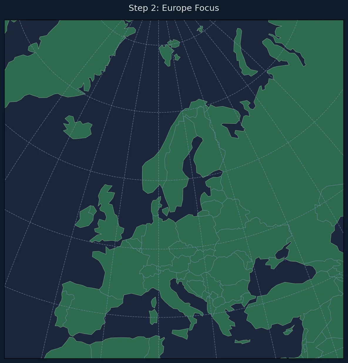
Europe-Centered Map
def create_europe_map():
    """Create an equal-area map of Europe."""

    fig = plt.figure(figsize=(10, 10))

    # LAEA projection centered on Europe
    proj = ccrs.LambertAzimuthalEqualArea(
        central_longitude=10.0,
        central_latitude=52.0
    )

    ax = fig.add_subplot(1, 1, 1, projection=proj)

    # Set extent to cover Europe
    ax.set_extent([-2500000, 3000000, -2000000, 3500000], crs=proj)

    ax.add_feature(cfeature.OCEAN, facecolor='#caf0f8')
    ax.add_feature(cfeature.LAND, facecolor='#f5ebe0')
    ax.add_feature(cfeature.BORDERS, linewidth=0.5, edgecolor='#6c757d')
    ax.add_feature(cfeature.COASTLINE, linewidth=0.5)

    ax.set_title('Europe - Equal-Area Projection', fontsize=14)

    return fig, ax

fig, ax = create_europe_map()
plt.savefig('europe_equalarea.png', dpi=150, bbox_inches='tight')
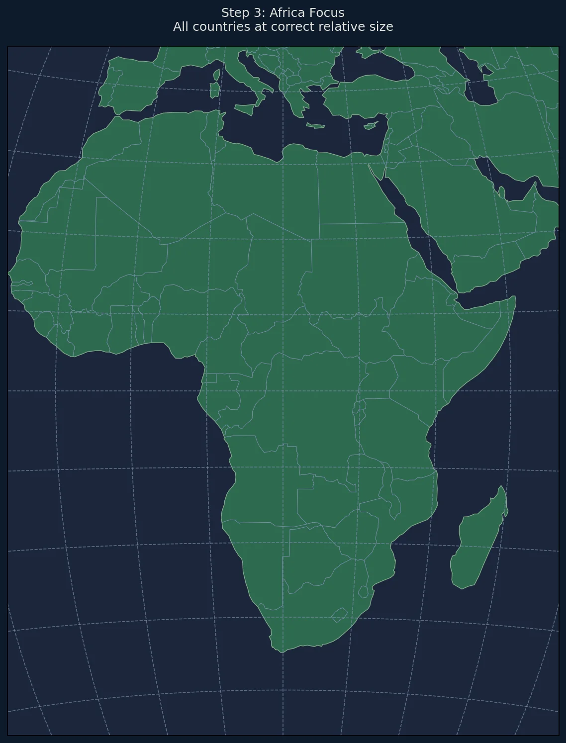
Africa-Centered Map
def create_africa_map():
    """Create an equal-area map of Africa."""

    fig = plt.figure(figsize=(10, 12))

    proj = ccrs.LambertAzimuthalEqualArea(
        central_longitude=20.0,
        central_latitude=0.0
    )

    ax = fig.add_subplot(1, 1, 1, projection=proj)
    ax.set_extent([-4000000, 4000000, -5000000, 5000000], crs=proj)

    ax.add_feature(cfeature.OCEAN, facecolor='#48cae4')
    ax.add_feature(cfeature.LAND, facecolor='#ffd166')
    ax.add_feature(cfeature.BORDERS, linewidth=0.5)
    ax.add_feature(cfeature.COASTLINE, linewidth=0.7)

    ax.set_title('Africa - Equal-Area Projection\nAll countries shown at correct relative size',
                fontsize=12)

    return fig, ax
Creating Choropleth Maps
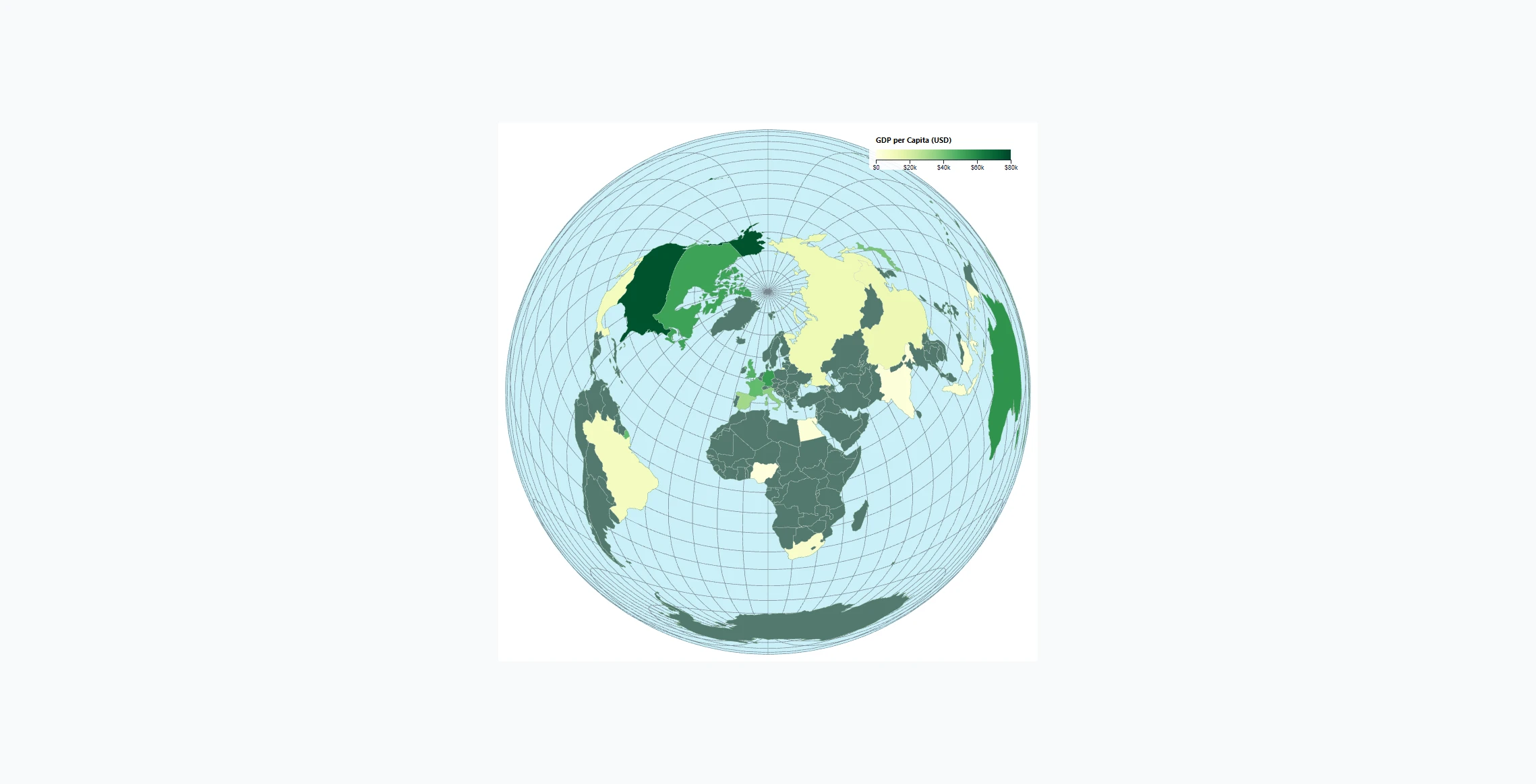
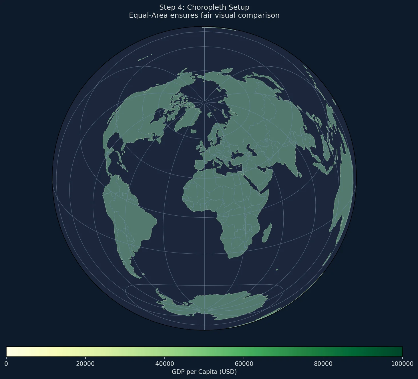
The primary use case for equal-area projections is choropleth maps—where regions are colored by data values.
Loading Country Data with GeoPandas
import geopandas as gpd
import pandas as pd

# Load current Natural Earth 1:110m country boundaries. GeoPandas 1.0+
# no longer bundles the former naturalearth_lowres sample dataset.
countries_url = (
    "https://naturalearth.s3.amazonaws.com/110m_cultural/"
    "ne_110m_admin_0_countries.zip"
)
world = gpd.read_file(countries_url).rename(
    columns={'ADMIN': 'name', 'POP_EST': 'pop_est'}
)

# Deliberately rounded sample values for styling only; these are not
# current economic estimates. Replace them with a cited, dated dataset.
gdp_data = {
    'Luxembourg': 115000,
    'Singapore': 98000,
    'Ireland': 94000,
    'Norway': 89000,
    'Switzerland': 87000,
    'United States of America': 76000,
    'Denmark': 68000,
    'Netherlands': 58000,
    'Australia': 56000,
    'Germany': 54000,
    'Sweden': 52000,
    'Canada': 52000,
    'United Kingdom': 47000,
    'France': 44000,
    'Japan': 40000,
    'Italy': 36000,
    'South Korea': 35000,
    'Spain': 32000,
    'China': 12500,
    'Brazil': 8900,
    'Russia': 12200,
    'India': 2400,
}

# Add GDP data to GeoDataFrame
world['gdp_per_capita'] = world['name'].map(gdp_data)
Rendering the Choropleth
import matplotlib.colors as mcolors
from matplotlib.cm import ScalarMappable

def create_choropleth(data_column, title, cmap='YlOrRd'):
    """
    Create a choropleth map with equal-area projection.

    Parameters:
    -----------
    data_column : str
        Column name in world GeoDataFrame to visualize
    title : str
        Map title
    cmap : str
        Matplotlib colormap name
    """

    fig = plt.figure(figsize=(14, 10))

    # Global equal-area projection
    proj = ccrs.LambertAzimuthalEqualArea(
        central_longitude=0,
        central_latitude=0
    )

    ax = fig.add_subplot(1, 1, 1, projection=proj)
    ax.set_global()

    # Add ocean background
    ax.add_feature(cfeature.OCEAN, facecolor='#e6f2ff')

    # Get data range for color normalization
    vmin = world[data_column].min()
    vmax = world[data_column].max()
    norm = mcolors.Normalize(vmin=vmin, vmax=vmax)

    # Project geometries and plot
    world_proj = world.to_crs(proj.proj4_init)

    for idx, row in world_proj.iterrows():
        value = row[data_column]

        if pd.isna(value):
            color = '#d3d3d3'  # Gray for no data
        else:
            color = plt.cm.get_cmap(cmap)(norm(value))

        ax.add_geometries(
            [row.geometry],
            crs=proj,
            facecolor=color,
            edgecolor='#333333',
            linewidth=0.3
        )

    # Add colorbar
    sm = ScalarMappable(cmap=cmap, norm=norm)
    sm.set_array([])
    cbar = plt.colorbar(sm, ax=ax, orientation='horizontal',
                        fraction=0.03, pad=0.05, aspect=40)
    cbar.set_label(data_column.replace('_', ' ').title(), fontsize=10)

    ax.set_title(title, fontsize=14, pad=15)

    return fig, ax

# Create GDP choropleth
fig, ax = create_choropleth(
    'gdp_per_capita',
    'GDP per Capita (USD)\nLambert Azimuthal Equal-Area Projection',
    cmap='YlGn'
)
plt.savefig('choropleth_gdp.png', dpi=150, bbox_inches='tight')
Population Density Map
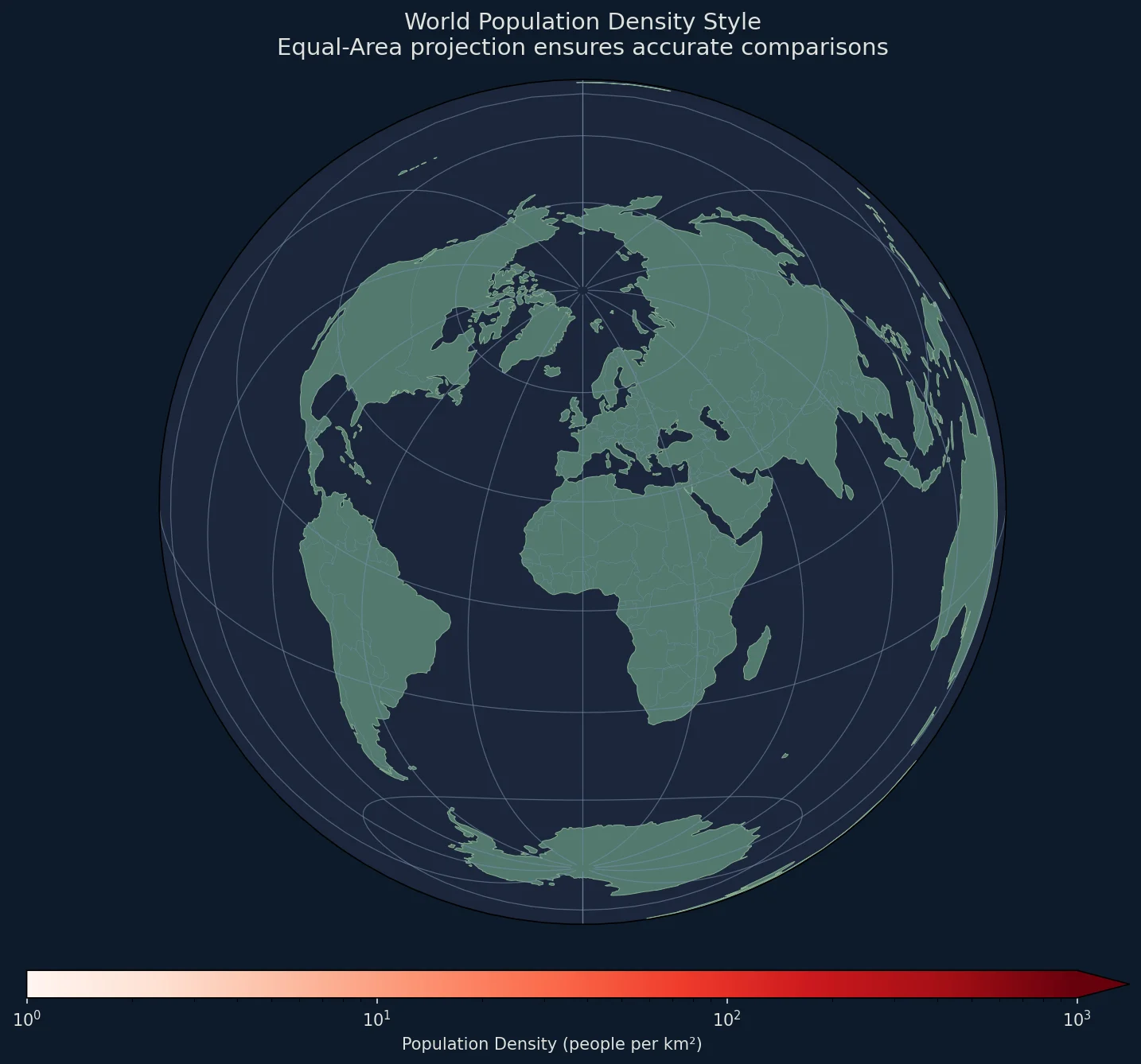
Population density is a standard use case for equal-area projections:
def create_density_map():
    """Create a population density choropleth."""

    fig = plt.figure(figsize=(14, 10), facecolor='white')

    proj = ccrs.LambertAzimuthalEqualArea(
        central_longitude=0,
        central_latitude=30
    )

    ax = fig.add_subplot(1, 1, 1, projection=proj)
    ax.set_global()

    # Calculate square kilometers only after projection to an equal-area CRS.
    # Computing .area in the source longitude/latitude CRS would yield degrees².
    world_proj = world.to_crs(proj.proj4_init)
    world_proj['density'] = (
        world_proj['pop_est'] / (world_proj.geometry.area / 1_000_000)
    )

    # Use log scale for density (varies from 2 to 1000+)
    norm = mcolors.LogNorm(vmin=1, vmax=1000)
    cmap = plt.cm.Reds

    ax.add_feature(cfeature.OCEAN, facecolor='#d4e6f1')

    for idx, row in world_proj.iterrows():
        density = row['density']

        if pd.isna(density) or density <= 0:
            color = '#e0e0e0'
        else:
            color = cmap(norm(min(density, 1000)))

        ax.add_geometries(
            [row.geometry],
            crs=proj,
            facecolor=color,
            edgecolor='#555555',
            linewidth=0.2
        )

    # Colorbar
    sm = ScalarMappable(cmap=cmap, norm=norm)
    sm.set_array([])
    cbar = plt.colorbar(sm, ax=ax, orientation='horizontal',
                        fraction=0.03, pad=0.05, aspect=40,
                        extend='max')
    cbar.set_label('Population Density (people per km²)', fontsize=10)

    ax.set_title('World Population Density\nEqual-Area Projection Shows True Relative Areas',
                fontsize=14, pad=15)

    return fig, ax

fig, ax = create_density_map()
plt.savefig('population_density.png', dpi=150, bbox_inches='tight')
Comparing Equal-Area vs Mercator
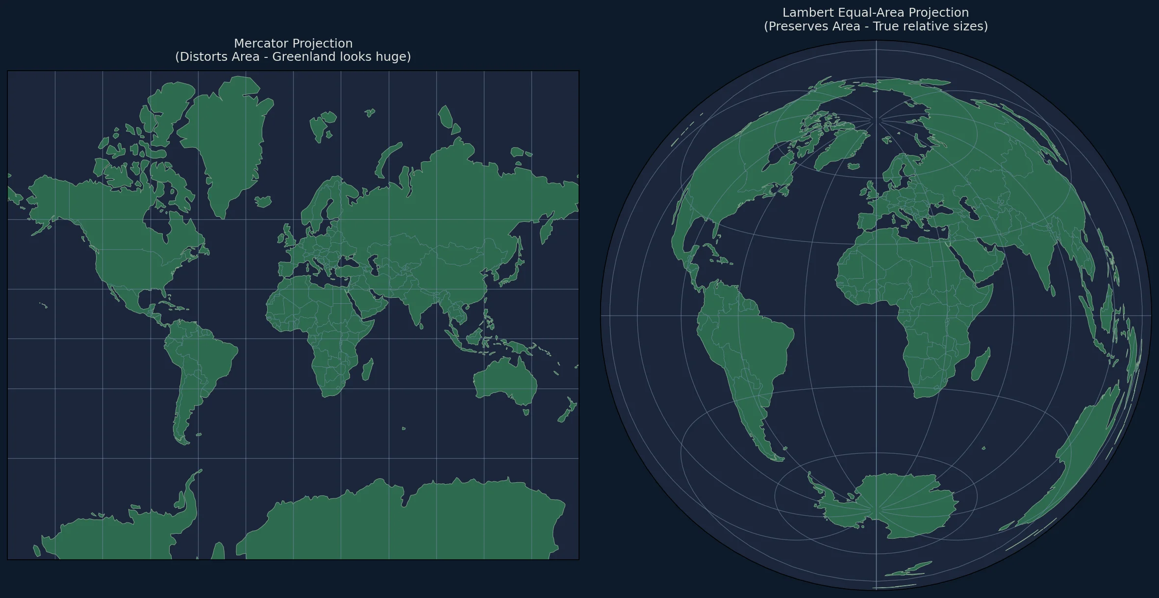
One of the most powerful demonstrations is showing how Mercator distorts area:
def compare_projections():
    """Side-by-side comparison of Mercator vs Equal-Area."""

    fig = plt.figure(figsize=(16, 8))

    # Mercator (distorts area)
    ax1 = fig.add_subplot(1, 2, 1, projection=ccrs.Mercator())
    ax1.set_global()
    ax1.add_feature(cfeature.LAND, facecolor='#90be6d')
    ax1.add_feature(cfeature.OCEAN, facecolor='#48cae4')
    ax1.add_feature(cfeature.COASTLINE, linewidth=0.5)
    ax1.add_feature(cfeature.BORDERS, linewidth=0.3)
    ax1.set_title('Mercator Projection\n(Distorts Area - Greenland looks huge)',
                 fontsize=12, pad=10)

    # Equal-Area (preserves area)
    ax2 = fig.add_subplot(1, 2, 2,
                          projection=ccrs.LambertAzimuthalEqualArea())
    ax2.set_global()
    ax2.add_feature(cfeature.LAND, facecolor='#90be6d')
    ax2.add_feature(cfeature.OCEAN, facecolor='#48cae4')
    ax2.add_feature(cfeature.COASTLINE, linewidth=0.5)
    ax2.add_feature(cfeature.BORDERS, linewidth=0.3)
    ax2.set_title('Lambert Equal-Area Projection\n(Preserves Area - True relative sizes)',
                 fontsize=12, pad=10)

    plt.tight_layout()
    return fig

fig = compare_projections()
plt.savefig('mercator_vs_equalarea.png', dpi=150, bbox_inches='tight')
Adding a Scale Indicator
Since equal-area projections distort distance, we can add an area reference instead:
def add_area_reference(ax, proj):
    """Add reference squares showing equal areas."""

    from shapely.geometry import box
    from shapely.ops import transform
    import pyproj

    # 1 million sq km reference squares
    area_size = 1000  # km (1000x1000 km = 1M sq km)

    # Positions for reference squares (in projected coordinates)
    positions = [
        (0, 0, 'Center'),
        (8000000, 0, 'Edge'),
    ]

    for x, y, label in positions:
        half = area_size * 500  # Convert to meters
        square = plt.Rectangle(
            (x - half, y - half),
            area_size * 1000,
            area_size * 1000,
            fill=False,
            edgecolor='red',
            linewidth=2,
            transform=proj
        )
        ax.add_patch(square)

        ax.text(x, y - half - 100000, f'{label}\n1M km²',
               ha='center', va='top', fontsize=8, color='red',
               transform=proj)
Complete Working Example
#!/usr/bin/env python3
"""
Generate Lambert Azimuthal Equal-Area maps with Python.
Ideal for choropleth maps and area comparisons.
"""

import matplotlib.pyplot as plt
import matplotlib.colors as mcolors
from matplotlib.cm import ScalarMappable
import cartopy.crs as ccrs
import cartopy.feature as cfeature
import geopandas as gpd
import pandas as pd
import numpy as np


def create_equalarea_choropleth(
    data: dict,
    title: str,
    label: str,
    center_lon: float = 0,
    center_lat: float = 0,
    cmap: str = 'YlOrRd',
    filename: str = None
):
    """
    Create a publication-quality equal-area choropleth map.

    Parameters:
    -----------
    data : dict
        Dictionary mapping country names to values
    title : str
        Map title
    label : str
        Colorbar label
    center_lon, center_lat : float
        Projection center
    cmap : str
        Matplotlib colormap
    filename : str
        Output filename (optional)

    Returns:
    --------
    fig, ax : matplotlib figure and axes
    """

    # Load Natural Earth 1:110m country boundaries
    countries_url = (
        "https://naturalearth.s3.amazonaws.com/110m_cultural/"
        "ne_110m_admin_0_countries.zip"
    )
    world = gpd.read_file(countries_url).rename(columns={'ADMIN': 'name'})
    world['value'] = world['name'].map(data)

    # Create figure
    fig = plt.figure(figsize=(14, 10), facecolor='white')

    # Projection
    proj = ccrs.LambertAzimuthalEqualArea(
        central_longitude=center_lon,
        central_latitude=center_lat
    )

    ax = fig.add_subplot(1, 1, 1, projection=proj)
    ax.set_global()

    # Ocean background
    ax.add_feature(cfeature.OCEAN, facecolor='#e8f4f8', zorder=0)

    # Normalize colors
    values = [v for v in data.values() if v is not None]
    vmin, vmax = min(values), max(values)
    norm = mcolors.Normalize(vmin=vmin, vmax=vmax)
    colormap = plt.cm.get_cmap(cmap)

    # Project and plot countries
    world_proj = world.to_crs(proj.proj4_init)

    for idx, row in world_proj.iterrows():
        value = row['value']

        if pd.isna(value):
            facecolor = '#e0e0e0'
            edgecolor = '#aaaaaa'
        else:
            facecolor = colormap(norm(value))
            edgecolor = '#333333'

        if row.geometry is not None:
            ax.add_geometries(
                [row.geometry],
                crs=proj,
                facecolor=facecolor,
                edgecolor=edgecolor,
                linewidth=0.3,
                zorder=1
            )

    # Graticules
    gl = ax.gridlines(linewidth=0.2, color='gray', alpha=0.5, linestyle=':')
    gl.xlocator = plt.FixedLocator(np.arange(-180, 181, 30))
    gl.ylocator = plt.FixedLocator(np.arange(-90, 91, 30))

    # Colorbar
    sm = ScalarMappable(cmap=colormap, norm=norm)
    sm.set_array([])
    cbar = plt.colorbar(
        sm, ax=ax,
        orientation='horizontal',
        fraction=0.025,
        pad=0.04,
        aspect=40
    )
    cbar.set_label(label, fontsize=11)
    cbar.ax.tick_params(labelsize=9)

    # Title
    ax.set_title(title, fontsize=14, fontweight='bold', pad=15)

    # Subtitle explaining the projection
    ax.text(
        0.5, -0.08,
        'Lambert Azimuthal Equal-Area Projection: All countries shown at correct relative size',
        ha='center', va='top',
        transform=ax.transAxes,
        fontsize=9, color='#666666'
    )

    plt.tight_layout()

    if filename:
        plt.savefig(filename, dpi=200, bbox_inches='tight',
                   facecolor='white', edgecolor='none')
        print(f"Saved: {filename}")

    return fig, ax


if __name__ == '__main__':
    # Synthetic values for demonstrating the rendering workflow.
    # Replace these with a cited dataset for analytical use.
    example_index = {
        'Iceland': 95,
        'Denmark': 90,
        'Switzerland': 85,
        'South Korea': 80,
        'United Kingdom': 75,
        'Netherlands': 70,
        'Germany': 65,
        'Japan': 60,
        'Canada': 55,
        'Australia': 50,
        'United States of America': 45,
        'France': 40,
        'Spain': 35,
        'Italy': 30,
        'Russia': 25,
        'Brazil': 20,
        'China': 15,
        'India': 10,
        'Nigeria': 5,
        'Ethiopia': 1,
    }

    fig, ax = create_equalarea_choropleth(
        data=example_index,
        title='Illustrative Country Index',
        label='Example index (synthetic)',
        cmap='Blues',
        filename='illustrative_index_equalarea.png'
    )

    plt.show()
Performance Tips
For Large Datasets
# Use simplified 1:110m boundaries for small-scale global maps
world = gpd.read_file(
    "https://naturalearth.s3.amazonaws.com/110m_cultural/"
    "ne_110m_admin_0_countries.zip"
)

# Use 1:50m boundaries only when the output needs the added detail
world = gpd.read_file(
    "https://naturalearth.s3.amazonaws.com/50m_cultural/"
    "ne_50m_admin_0_countries.zip"
)

# For production, download 10m resolution from Natural Earth
Caching Projections
from functools import lru_cache

@lru_cache(maxsize=16)
def get_equal_area_proj(center_lon, center_lat):
    return ccrs.LambertAzimuthalEqualArea(
        central_longitude=center_lon,
        central_latitude=center_lat
    )
Parallel Processing for Batch Maps
from concurrent.futures import ProcessPoolExecutor

def generate_map(params):
    data, title, label, center, filename = params
    return create_equalarea_choropleth(
        data, title, label,
        center_lon=center[0], center_lat=center[1],
        filename=filename
    )

# Generate multiple maps in parallel
params_list = [...]
with ProcessPoolExecutor(max_workers=4) as executor:
    executor.map(generate_map, params_list)
Common Issues
Issue: Countries Missing
# Check if geometry is valid
world = world[world.geometry.is_valid]

# Fix invalid geometries
from shapely.validation import make_valid
world['geometry'] = world['geometry'].apply(make_valid)
Issue: Projection Doesn't Match
# A custom Lambert azimuthal CRS generally has no EPSG code. Use its
# explicit PROJ definition when transforming the GeoDataFrame.
world_proj = world.to_crs(proj.proj4_init)
Exporting for Different Uses
High-Resolution Print
plt.savefig('map_print.png', dpi=300, bbox_inches='tight')
plt.savefig('map_print.pdf', format='pdf', bbox_inches='tight')
Web-Optimized
plt.savefig('map_web.png', dpi=100, bbox_inches='tight')

# Convert to WebP
from PIL import Image
Image.open('map_web.png').save('map_web.webp', 'WEBP', quality=85)
Interactive (with Folium)
import folium

# Note: Folium uses Web Mercator, but you can export equal-area as image overlay
# For true equal-area interactive maps, use D3.js
Next Steps
- Explore D3.js Equal-Area tutorial for interactive web maps
- Learn about azimuthal equidistant projections for distance-based maps
- Read our guide on choosing between projections